

The Collector's Corner: Designing a Dedicated Money Wall Art Zone
A collection of money wall art deserves more than a spare patch of wall.
Give it a dedicated zone and it can become the visual engine of your room: a sharp, gallery-style display that feels personal, intentional and full of attitude. Think less “random prints above the sofa” and more “private exhibition with a street-level pulse.”
A collector’s corner can work in a home office, hallway, lounge, dressing room or creative studio. The key is to build a display with hierarchy. Start with one powerful hero piece, layer in supporting works, then use rails, shelves and lighting to give the collection room to evolve.
Here’s how to create one.
Start with One Hero Piece of Money Wall Art
Every strong collection needs an anchor.
Choose the largest, rarest or most emotionally significant piece first. This could be an original canvas, a large-format pop art canvas or a vivid acrylic print with enough visual weight to command attention.
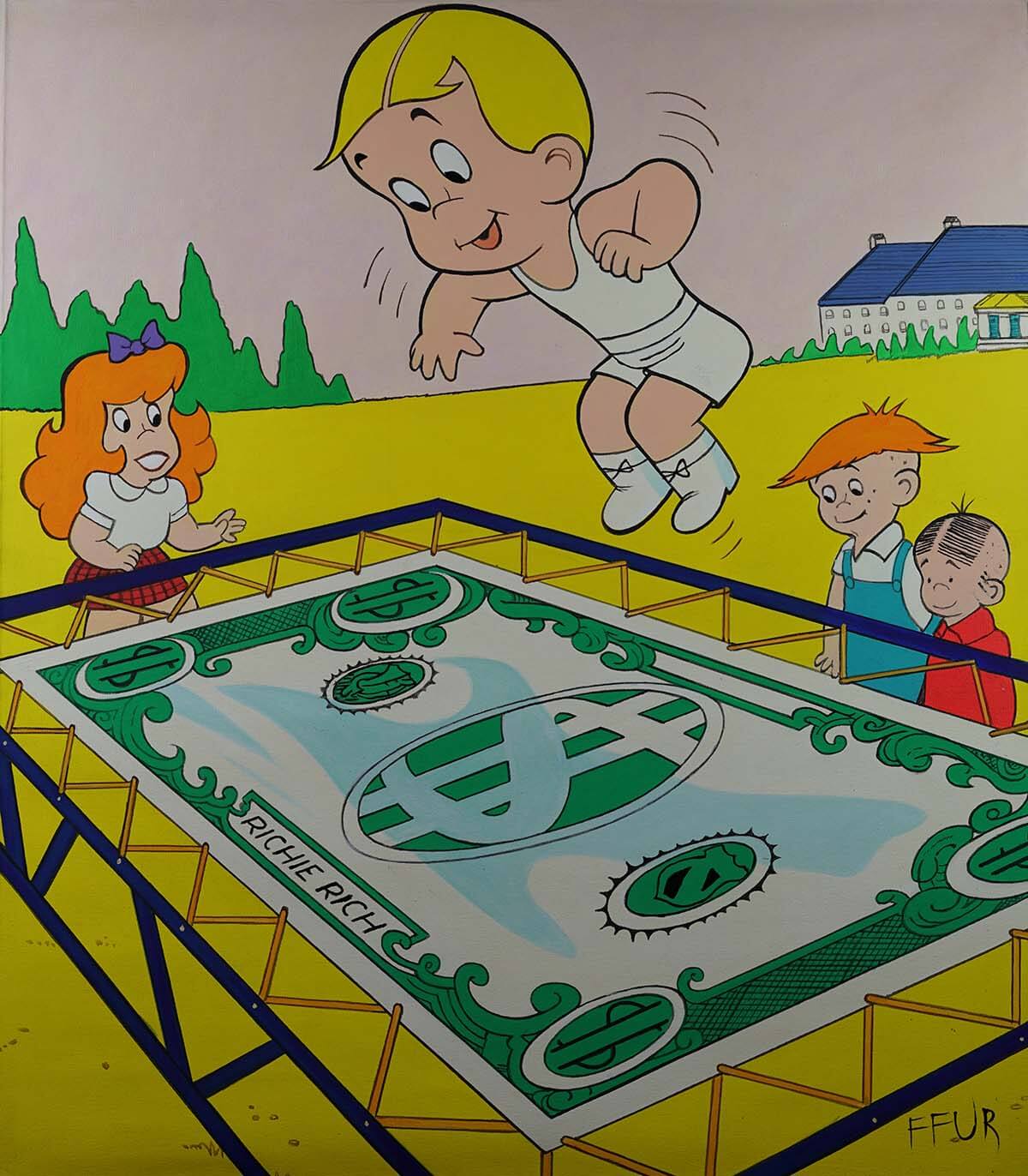
FFUR’s original Stretching Dollar artwork, for example, takes the idea of financial independence and turns it into a bold visual statement. It can act as the centre of your arrangement, with smaller works building rhythm around it.
Your hero piece does not have to sit exactly in the middle. A slightly off-centre position can create a more dynamic, contemporary composition. Place it where the eye naturally lands first, then arrange the rest of the display to support its movement.
Consider the wall as a visual stage. The hero canvas is the headline; everything else is the supporting cast.
Define the Zone Before You Hang Anything
A dedicated money wall art zone does not need to take over an entire room. It simply needs a clear boundary.
You could define the area with:
- A gallery rail mounted across one section of wall
- A long picture ledge beneath the artwork
- A contrasting paint colour or textured wall finish
- A console, desk or narrow cabinet underneath
- A focused picture light above the arrangement
- A floor-to-ceiling group of framed pieces
Before drilling, measure the width and height of the proposed zone. Then lay your artwork on the floor and arrange it as one composition.
Painter’s tape can help you mark the outer edges on the wall. This is especially useful if you are combining different formats, such as one large canvas, three framed prints and a small acrylic piece.
Try to make the complete grouping occupy roughly 60–75% of the available wall area above furniture. Too little coverage can make an important collection feel lost. Too much can make the display look crowded and frantic.
Bold is good. Chaotic is optional.
Build a Layered Gallery Rail Display
Gallery rails are ideal for collectors because they offer flexibility without sacrificing polish. You can change the arrangement, add new pieces and rotate seasonal favourites without creating a new constellation of holes in the wall.
For a strong display, install the rail slightly above eye level and let the artwork hang into the viewing zone. Use different frame sizes, but keep one detail consistent: frame colour, material or spacing.
A black rail with black, white or natural wood frames can create a clean structure around vibrant money wall art. If your collection uses electric blue, canary yellow, red and green, a restrained frame palette will help the artwork do the shouting.
Layering is where the street-art energy comes in. Allow one smaller frame to overlap another slightly. Rest a slim print against the wall rather than hanging every piece with military precision. Add a narrow ledge below the rail for a few art books, a small sculptural object or a framed fragment from your wider collection.
The result should feel curated, not over-designed.
Mix Formats for More Depth
A collector’s corner becomes more interesting when every piece does not behave in the same way.
Use format to create contrast:
- Original canvas: Your rarest and most tactile focal point
- Acrylic print: A sleek option with vivid colour, clarity and visual depth
- Framed poster: A flexible way to expand a series or theme
- Printed canvas: A larger statement format for filling space
- Small framed works: Useful for rhythm, balance and rotation
FFUR’s Acrylic Prints collection is particularly suited to a modern collector’s corner. Acrylic offers a high-gloss finish and a sense of depth that can make saturated colours appear more luminous. Its lightweight, ready-to-hang format also makes it practical for a display that changes over time.
For a more classic gallery feeling, explore the Framed Prints collection. Consistent framing can make several different images read as one coherent body of work.

Create a Visual Conversation
The strongest money wall art displays are not just collections of dollar signs. They have a point of view.
Look for a relationship between the works. Perhaps one piece explores ambition, another plays with excess, while a third questions what financial freedom really means. This gives the display a narrative rather than making it feel like a showroom.
You can also connect works through colour. Repeat one accent shade across the arrangement: the red of a bow tie, the green of currency, the yellow of a background or the deep blue of a graphic shadow.
If your hero artwork is highly saturated, consider surrounding it with monochromatic or neutral prints. This creates a split-tonal effect: intense colour against quieter visual moments. It is a classic pop-art strategy and an excellent way to keep a bold collection feeling sophisticated.
FFUR’s Original Art collection is a useful starting point if you want to build around rare, statement-led pieces.
Use Shelves to Make the Display Evolve
A shelf gives your collection a second layer.
Choose a narrow picture ledge rather than a deep domestic shelf. It will keep the focus on the artwork while giving you enough room to rotate smaller pieces and add a few meaningful objects.
You might display:
- A smaller framed money print
- A stack of art or design books
- A signed detail or artist card
- A small abstract sculpture
- A compact frame leaning in front of a larger one
- A notebook for recording future acquisitions
Keep the shelf edited. Three to five objects are usually more effective than filling every inch.
A good rule is to vary height and texture. Pair a flat framed print with a rounded sculptural object, or balance a glossy acrylic finish with raw canvas and matte paper. This contrast makes the display feel tactile and considered.
Get the Height and Spacing Right
For a standard wall display, aim to place the centre of the overall arrangement around 57–60 inches from the floor. If the zone is above a desk or console, you may want to bring it slightly lower so it works naturally from a seated position.
When hanging above furniture, leave approximately 6–8 inches between the furniture and the lowest frame or canvas. The display should feel connected to the furniture without appearing trapped by it.
Spacing depends on scale:
- Small frames: around 2–3 inches apart
- Larger frames: around 4–6 inches apart
- Mixed layouts: use a consistent visual rhythm rather than forcing identical gaps
Imagine the entire gallery as one large rectangle. Centre that rectangle, rather than centring every individual piece.
Light It Like a Mini Museum
Lighting can take your collector’s corner from flat to electric.
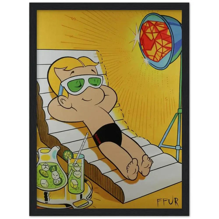
A slim picture light above the hero canvas gives the display an exhibition feel. Track lighting can work well for a larger wall, while a directional LED spotlight can highlight an acrylic print’s glossy depth.
Avoid placing valuable artwork in direct sunlight. The Smithsonian’s guidance on caring for paintings recommends keeping paintings away from direct sun, heat sources and unstable humidity. The Library of Congress also advises that works on paper should be kept in a cool, clean and stable environment away from damaging light and environmental fluctuations.
For a home display, consider:
- Low-heat LED lighting
- UV-filtering glazing for sensitive framed works
- Curtains or blinds where sunlight is strong
- An interior wall away from radiators and vents
- A stable room rather than a bathroom, kitchen or damp hallway
Good lighting should reveal texture and colour without bleaching the collection over time.
Leave Room for the Next Acquisition
A collector’s corner should not look finished forever.
Leave a little breathing room on the rail or ledge for the next piece that stops you in your tracks. This empty space is not wasted space; it gives the collection tension and allows it to grow.
You could rotate smaller pieces every few months while keeping the main canvas fixed. Or change the supporting works when you refresh the room, giving familiar art a new context.
That is the advantage of designing a display zone instead of simply hanging pictures. Your money wall art becomes an evolving visual archive: part personal statement, part investment in your surroundings, part unapologetic celebration of ambition.
Make the Corner Yours
A dedicated collector’s corner does not need to follow a formula. It needs a strong point of view.
Start with one unforgettable artwork. Build around it using rails, shelves and contrasting formats. Keep the spacing intentional, the lighting controlled and the supporting pieces connected by colour or meaning.
Then let the display carry its own energy.
Whether you choose an original FFUR canvas, a luminous acrylic print or a carefully framed pop-art poster, the goal is the same: create a zone that transforms your wall into a statement. Not quiet decoration. Not background filler.
A proper collector’s corner should feel like your own private gallery: with sharper edges, louder colour and a little more financial freedom in the frame.